Conscious Physicians
Psychedelics Academy
Design system & visual identity guide. Persian-inspired geometric minimalism rooted in New Mexico's iconic color heritage.
Primary Palette
Drawn from the New Mexico flag and iconic turquoise license plate. These three colors anchor every design decision.
- Hex
- #FFD700
- RGB
- 255, 215, 0
- CMYK
- 0, 16, 100, 0
- PMS
- Yellow 012 C
- Hex
- #BF0A30
- RGB
- 191, 10, 48
- CMYK
- 0, 95, 75, 25
- PMS
- 200 C
- Hex
- #00A5A8
- RGB
- 0, 165, 168
- CMYK
- 100, 2, 0, 34
- PMS
- 7714 C
Neutrals
Secondary Palette
Sandia Sunset, Green Chile, and Deep Dusk complete the color wheel. Evokes expanded consciousness while remaining sophisticated through restrained application.
- Hex
- #ED8B00
- RGB
- 237, 139, 0
- CMYK
- 0, 50, 100, 0
- PMS
- 144 C
- Hex
- #A8AA19
- RGB
- 168, 170, 25
- CMYK
- 37, 14, 100, 0
- PMS
- 383 C
- Hex
- #8A387C
- RGB
- 138, 56, 124
- CMYK
- 45, 95, 5, 0
- PMS
- 7656 C
Complete Palette
Primary colors dominate at ~80%. Secondary colors accent at ~20% — data viz, badges, featured content, and dark mode contexts.
Type System
Three-font system: elegant serif display, clean geometric sans-serif, and utilitarian monospace. All available free from Google Fonts.
Psychedelic Medicine
Light 300 · Regular 400 · Medium 500 · Semibold 600 · Bold 700 · Italic
Use for: Headlines, hero text, section titles, pull quotes
Light 300 · Regular 400 · Medium 500 · Semibold 600 · Bold 700 · ExtraBold 800
Use for: Body text, navigation, buttons, captions, UI labels
Session: Ketamine Protocols · Duration: 02:15:00
Light 300 · Regular 400 · Medium 500
Use for: Data labels, section numbers, metadata, badges
Type Scale
Spatial System
8px base unit with geometric progression. Mathematical precision echoing Persian design.
12-Column Grid
Max 1280px, 24px gutter, centered with fluid padding.
Responsive Breakpoints
Border Radius
Contrast Matrix
WCAG 2.1 contrast ratios. Only AA+ combinations for text. Decorative use may use failing pairs at designer discretion.
✓ Safe Combinations (AA+)
✗ Avoid for Text
Always use Turquoise Dark (#006F72) for text on light backgrounds. Base Turquoise (#00A5A8) fails AA at 3.1:1 — use it only for decorative elements, backgrounds, and borders.
Gold never carries white text (1.3:1 contrast). Use Near Black or Charcoal text on gold backgrounds. Gold is for accents, highlights, and card bars.
Red on Gold is decorative only (2.6:1). Never use as body text. For text on Red backgrounds, use White (#FEFDFB) which passes AA at 6.2:1.
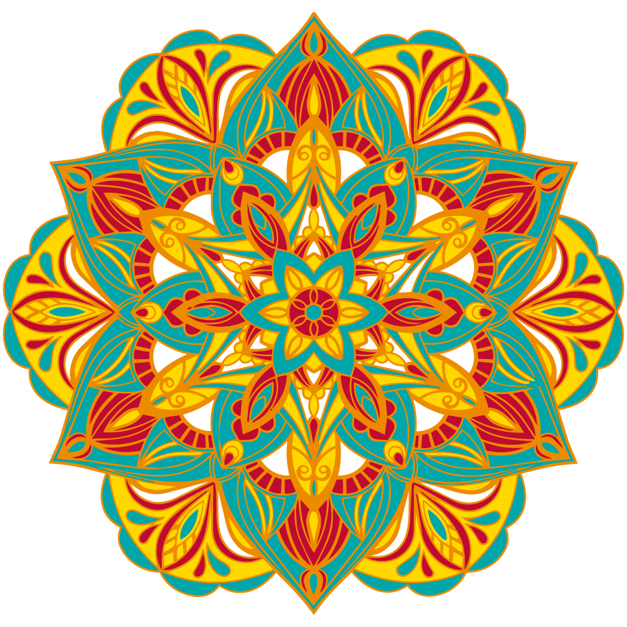
CPPA Mandala
The primary brand mark — a Persian-inspired geometric mandala using the full CPPA palette. The layered petal form represents the trimesters of transformation, with the open center symbolizing consciousness and possibility.
Size Variants
Watermark & Overlay Treatments
Logo + Wordmark Lockups
Header: 120px
Nav: 72px
Footer: 48px
Favicon: 32px
Inline: 24px
Watermark: 200px+ at 4–8% opacity
Minimum clear space equal to 25% of the mark's width on all sides. Never crowd with text or other elements.
PNG with transparent background. Works on cream, white, and dark surfaces without modification. No black background should be added.
Templates & Formats
Guidance for applying the design system to the most frequently produced brand assets: email communications and social media content.
Email Header Pattern
Social Media Formats
Square post: 1080x1080
Story/Reel: 1080x1920
Link preview: 1200x630
Profile banner: 1500x500
Headlines: Cormorant Garamond (rasterize for social)
Body: Plus Jakarta Sans
Labels: DM Mono
Minimum text size: 24px for readability
Always include mandala or color bar
Cream background default; dark for dark mode
Watermark mandala at 4–6% opacity
Color bar as footer element on all posts
Downloadable Assets & Document Design
Ready-to-use graphics for headers, footers, and documents. Available in SVG and PNG, light and dark versions. Download the .docx template to start creating branded materials immediately.
Document & PDF Design
For handouts, syllabi, letters, and printed materials. Download these header graphics and insert into Google Docs, Word, or any PDF layout tool. Available in SVG and PNG formats, light and dark versions.
Color Bar

Full Header (Color Bar + Wordmark)


Logo + Wordmark
Page 1: Full Header graphic (color bar + logo wordmark). Subsequent pages: Logo + Wordmark lockup only. Footer on all pages: Color Bar as a horizontal rule with copyright text below. Use light versions on white/cream backgrounds, dark versions on near-black.
Page size: Letter (8.5" x 11"). Margins: ~0.6" all sides. Line spacing: 1.5x (360 twips). Page color: White (#FEFDFB).
Title: Georgia, 22pt, #1E1C1A
Subtitle: Georgia, 18pt, italic, #8A387C (Deep Dusk)
Section Labels (H1): Courier New, 10pt, uppercase, #006F72 (Turquoise Dark)
Section Headings (H2): Georgia, 14pt, bold, #1E1C1A
Body: Arial, 11pt, #3A3632 (Charcoal)
All text minimum 10pt.
Callout boxes: Single-cell table with cream (#FAF7F0) cell background and black border. Editable in Google Docs via Table properties > Cell background color.
Quote blocks: Single-cell table with lavender (#F7F0F6) cell background. Text in Georgia italic.
Bulleted lists: Standard list formatting with bold lead terms.
Download the .docx template below and edit directly — all styles, headers, footers, and formatting are pre-configured.
STARTING FROM SCRATCH
1. Download the PNG versions of the header assets (Google Docs does not support SVG; Word supports both).
2. Insert the Full Header PNG into the page 1 header. In Google Docs: Insert > Headers & Footers > Header, check "Different first page," then Insert > Image.
3. Insert the Logo + Wordmark PNG into the default header (used on all pages after page 1).
4. Insert the Color Bar PNG into the footer on all pages.
5. Set fonts: Section labels to Courier New 10pt in turquoise-dark (#006F72). Headings to Georgia 14pt bold. Body to Arial 11pt.
6. For callout boxes: Insert a 1x1 table, then set the cell background to cream (#FAF7F0) via Table properties > Cell background color. For quote blocks, use lavender (#F7F0F6).
7. For dark documents, use a dark page background (#1E1C1A) with the dark versions of the header and wordmark assets.
View the PDF example, download the .docx template, or make a copy in Google Docs to start editing immediately
Patterns & Imagery
Persian geometric tessellations and Zia-inspired motifs paired with intentional photography direction. Patterns function as texture — never decoration for its own sake.
Geometric Patterns
Usage: Patterns at 3–6% opacity as section backgrounds. Tessellations tile seamlessly for larger surfaces. Single motifs work as watermarks. Gold linework on dark backgrounds for dark sections.
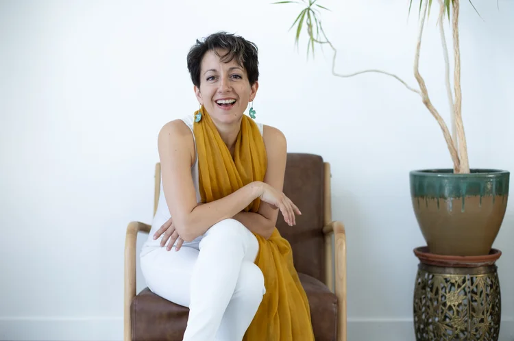
Photography & Color Treatment


— Warm color grading (shift toward gold)
— 20–30% desaturation for cohesion
— NM landscapes: mesas, Sandias, high desert
— Authentic clinical settings, real people
— Botanical / plant medicine close-ups
— Persian architectural details as texture
— Generic stock "happy doctors" with stethoscopes
— Cool/blue grading (conflicts with warmth)
— Psychedelic trip imagery or kaleidoscope effects
— Mushroom close-ups as hero images (too literal)
— Low-res or watermarked placeholders
— Over-saturated or HDR-processed photos
Icon System
Thin-stroke geometric line icons using the brand palette. 1.5px weight, round cap & join. Recommended base: Phosphor Icons (Thin variant, 1.5px stroke) or a custom set matching these specifications.
1.5px weight
Round cap & join
No fills (outline only)
24×24px base grid
16px for inline/small
32px for feature cards
Brand palette colors
Tinted background circles
Mid Gray for disabled state
Buttons & Interface
Minimal, functional components with sharp corners and clear hierarchy. Primary CTA uses Deep Dusk in light mode, Turquoise in dark mode.
Hover: Background darkens 10–15%
Active/Pressed: Background darkens 20–25%
Disabled: 45% opacity, cursor: not-allowed
Loading: Text replaced with "Loading..." or spinner
Focus: 3px turquoise ring via box-shadow (visible on :focus-visible only)
Marquee / Scroll Ticker
Smooth-scrolling ticker in two variants: light and dark.
Cormorant Garamond
Light 300, clamp(1.8rem,4vw,3rem)
20–30s linear infinite
CSS translateX
✦ (U+2726) in Deep Dusk or Gold
32px horizontal padding
3px solid ring using
box-shadow: 0 0 0 3px rgba(0,165,168,0.12)Applied to all interactive elements on :focus-visible
Default: Deep Dusk (#8A387C)
Hover: Deep Dusk Dark (#622858)
Visited: Deep Dusk at 70% opacity
Focus: Turquoise ring + Deep Dusk text
Brand Voice
CPPA's voice bridges clinical authority with spiritual accessibility. Every piece of communication should feel like a trusted colleague inviting you into deeper work — never prescriptive, always invitational.
Tone Spectrum
Accreditation materials, legal disclosures, CME documentation, refund policies, partnership agreements
Example: "Participants who opt out within the first 30 days are eligible for a 50% tuition refund."
Website copy, program descriptions, faculty bios, curriculum pages, email campaigns
Example: "We guide facilitators from trauma to self-love to service."
Social media, testimonials, podcast descriptions, community messages, retreat communications
Example: "We LOVE people. Our mission is simple: help humans live whole, joyful, soul-aligned lives."
Language Guidelines
Process: integration, preparation, ceremony, practice
Qualities: conscious, trauma-informed, evidence-based, lawful
Journey: transformation, self-discovery, healing, sustainable
Action: discover, cultivate, explore, unlock, experience
Community: connection, reciprocity, service, interdisciplinary
Method: Conscious Life Practices (CLPs), Conscious Physicians Method
Instead of "drug" — use "medicine" or "compound"
Instead of "patient" — use "participant" or "member"
Instead of "cure" — use "support," "facilitate," or "guide"
Instead of "expert" — use "guide," "mentor," or "faculty"
Avoid: quick-fix language, shame/deficit framing, spiritual bypassing, corporate jargon, unsubstantiated health claims
Never: guarantee outcomes, use fear-based urgency, or claim to replace conventional treatment
CTA Language Patterns
"Apply Now" — enrollment actions
"Schedule a Discovery Call" — exploratory conversations
"Learn More" — secondary exploration
"Start Your Journey" — aspirational entry points
Direct, benefit-focused, low-pressure
Action-oriented verbs over passive language
Never: "Buy Now," "Don't Miss Out," "Limited Time"
Acceptable urgency: "Next cohort starts [date]"
Dark Mode
Dark mode is not just an aesthetic preference — it represents the reflective and contemplative dimension of CPPA's work. Use it intentionally for retreat materials, evening content, and reflective contexts.
When to Use Dark Mode
— Evening or contemplative content
— Dark sections within longer pages
— Marquee CTA banners
— Social media posts about inner work / ceremony
— The "Apply Now" scrolling banner
— Educational content and curriculum
— Application and enrollment flows
— Email communications (most clients)
— Faculty bios and program details
— Pricing and accreditation information
Color Variable Overrides
Side-by-Side Comparison
Live Preview
A complete page mockup applying the design system. Toggle between light and dark mode to see both treatments.
Conscious Physicians · Psychedelics AcademyConscious Physicians
Psychedelics Academy
The first CME-accredited psychedelic facilitator training rooted in evidence-based science, trauma-informed care, and New Mexican wisdom.
Ketamine Protocols
Advanced IV ketamine techniques for treatment-resistant depression.
Psilocybin Integration
Trauma-informed frameworks for post-ceremony integration support.
NM Legal Framework
Understanding the Medical Psilocybin Act and facilitator certification pathways.
"This program gave me the tools to reclaim and transform my life."— CPPA GRADUATE · COHORT I
Conscious Physicians Psychedelics Academy
Changelog
MAR 2026
- Replaced SVG mandala placeholders with actual CPPA mandala logo (transparent PNG)
- Added Brand Mark section: background variants, size variants, watermark treatments, wordmark lockups, download link
- Added Voice & Tone section based on drlidafatemi.com brand voice analysis
- Added Email & Social Media template guidance with format specs
- Added Dark Mode full specification with color variable override table
- Enhanced Accessibility section: quick reference card, font-size minimums, focus/link state specs
- Added complete type specifications table with line-height and letter-spacing values
- Added button states documentation: hover, active, disabled, loading, focus
- Replaced photography placeholders with real reference photos from drlidafatemi.com
- Added Phosphor Icons link and variant specification
- Added responsive breakpoints table (desktop, tablet, mobile)
- Updated Example Page to use actual mandala logo in nav and footer
- Published as Next.js page at /style-guide